Kitchens are no longer just functional workspaces — they’re social hubs, family meeting points, and a place to unwind with a coffee or a glass of wine.

The colours you choose will influence everything from the mood to how big (or small) your kitchen feels.
Here are a few key ways colour affects perception:
- Size: Lighter colours reflect more light, helping a kitchen feel larger and more open. Darker tones add depth and drama, especially when used thoughtfully on cabinetry or walls.
- Temperature: Warm shades like terracotta or mustard can make a north-facing kitchen feel more inviting. Cooler hues like sage or powder blue can help balance out a space that gets strong afternoon sun.
- Mood: Bold colours energise; soft tones calm. If you want your kitchen to feel relaxed and welcoming, the palette plays a big part.
Light vs Dark: Which Way to Go?
If you’re working with a small kitchen or limited natural light, pale shades like soft white, ivory, or gentle greys can help bounce light around and make the space feel more expansive. Think walls, cabinetry, or even splashbacks.
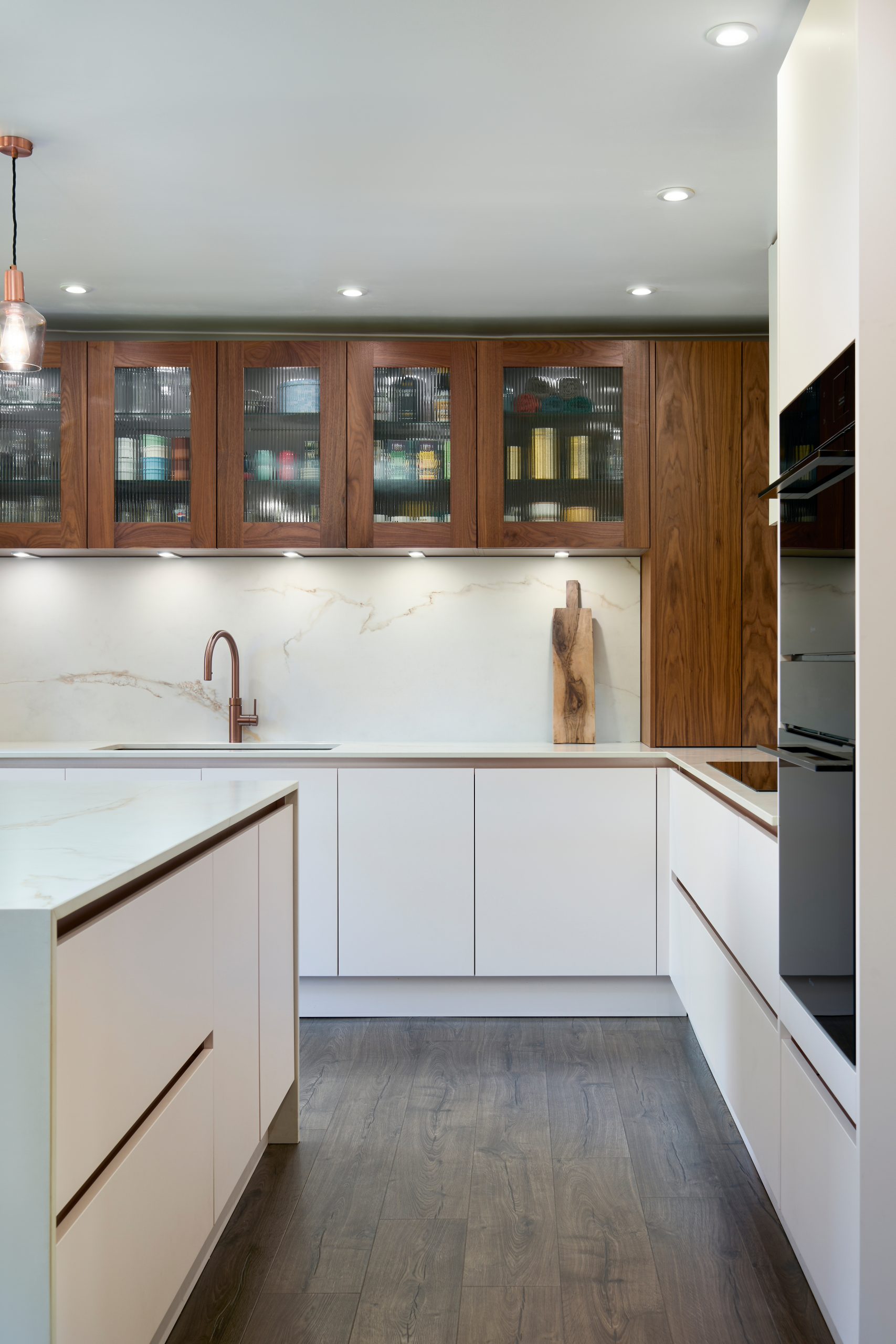
But don’t rule out darker tones — navy, charcoal, or deep green can create a beautifully grounded look, especially on base cabinets or an island. Combined with good lighting and lighter countertops, darker units can feel luxurious, not heavy.
Design Tip: Balance darker colours with light worktops, open shelving, or metallic hardware for contrast and interest.
Warm Colours in Kitchens: Inviting and Uplifting
Warm tones are a natural fit for kitchens and dining spaces — they spark conversation, lift the mood, and make a room feel lived-in.
- Terracotta or burnt orange: Earthy and inviting, great for tiles or accent walls.
- Soft mustard or ochre: Works beautifully with greys and wood tones.
- Rust or brick red: Adds richness but needs to be balanced carefully.
These shades can feel cosy and characterful — just avoid going too strong on every surface. A warm-toned feature wall or a few accessories can go a long way.
Cool Colours: Calm and Contemporary
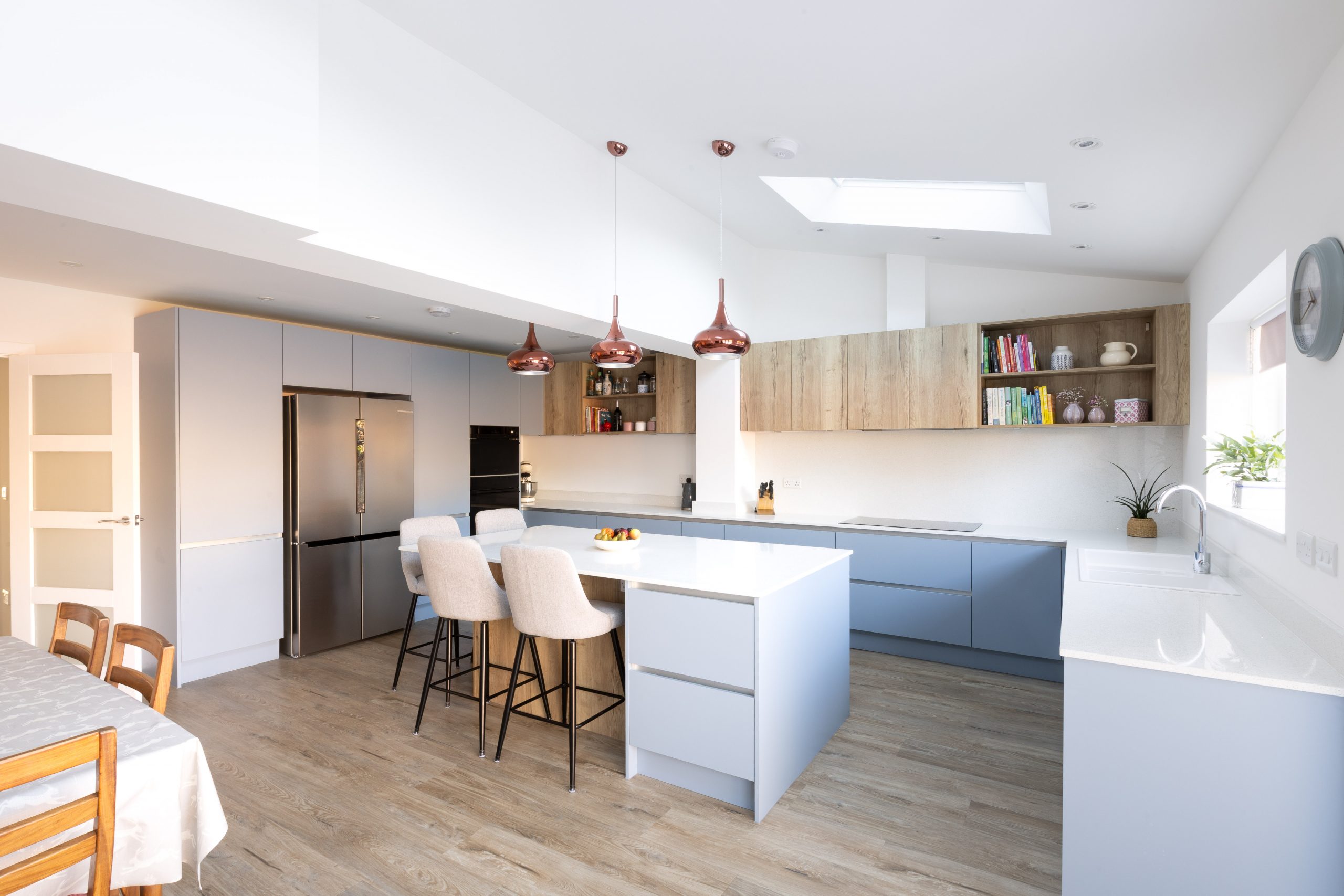
Cool colours work particularly well if your kitchen leans modern or minimalist. Soft sage, pale blue, or even a gentle lavender can help the space feel fresh and calming — ideal if your kitchen opens into a larger living space.
- Sage green: A timeless favourite for cabinets — calming and grounded.
- Powder blue: Reflects light and brings a cheerful, coastal vibe.
- Muted lilac: Sophisticated when paired with marble or brass finishes.
Cool tones can also take the edge off a very sunny kitchen, helping the space feel more balanced year-round.
The Power of Neutrals
If you’re worried about colour dating quickly, neutrals are your best friend. But neutral doesn’t mean boring.
- Soft whites and greys: Keep things light, clean, and versatile.
- Taupe or greige: Add warmth and depth to walls or cabinetry.
- Charcoal or black: Great for hardware, taps, or framing details.
Layering neutral shades with different textures — timber, stone, metals — is a great way to add depth without going bold on colour.
Accent Colours: Small Touches, Big Difference
You don’t need to commit to bold cabinets or walls to bring colour into your kitchen. Accent colours can appear in:
- Bar stools
- Tile splashbacks
- Lighting fixtures
- Small appliances
- Open-shelf accessories
If you’re working with a mainly neutral palette, a pop of teal, blush, or mustard in just a few places can add personality without overwhelming the space.
Quick Rule of Thumb: Try the 60-30-10 approach:
60% main colour (walls/cabinets), 30% secondary (worktops/flooring), 10% accent (accessories, stools, lighting).
Don’t Forget About Lighting
Natural and artificial light change how colours look throughout the day.
- A grey that feels calm and warm in the morning might go blue and chilly by evening.
- Warm bulbs will enhance golds, reds, and earth tones.
- Cool LED lighting brings out blues and greens more strongly.
Always test samples in your own kitchen at different times of day before making a final decision — it’s worth the extra step.
Final Thoughts: Let Colour Work Harder For You
Your kitchen is one of the most-used rooms in your home — and it deserves to feel exactly right. Whether you’re going for timeless and tranquil or bold and energetic, colour is key to shaping the experience of your space.
Take your time, test different tones, and don’t be afraid to add contrast. You don’t need to follow trends — just find the balance that suits your lifestyle, lighting, and layout.
Need Help Picking the Perfect Colours for Your Kitchen?
I offer tailored design consultations to help you choose a colour palette that works beautifully with your space, cabinetry, and natural light. Whether you’ve got a full vision or no idea where to start, I’ll help bring your ideas to life.
Book a free consultation here: https://vickyelmorekitchens.co.uk/contact
Have a good week!
Vicky